Client: QBench
Project: UX/UI Product Redesign
Role: UX/UI Designer
QBench is a Laboratory Information Management System (LIMS) that helps testing labs manage the end-to-end testing workflow from sample receiving to automated results reporting.
The main problem they were facing was that lab customers (end users) were having issues navigating the application and would become frustrated and give up altogether. QBench approached me with the task of designing a new user experience and overhauling the UI to make the journey more intuitive and efficient.
CHALLENGE
Make it easy for customers to submit new orders and find info on their existing orders
When attempting to create a new order to submit their samples, laboratory customers were confused by the existing UI and were giving up in frustration.
Furthermore, once a customer had submitted an order, there was no easy way for them to find relevant information on their samples and see test results.
Stakeholder Interviews and Requirements-Gathering
I started by interviewing the CEO (who also was acting as product manager) and the Director of Customer Success to understand the business and end user goals for the project, which were as follows:
Business Goals
- Increase user stickiness/decrease user drop-off
- Decrease support requests
End User Goals
- Create and submit an order for sample testing
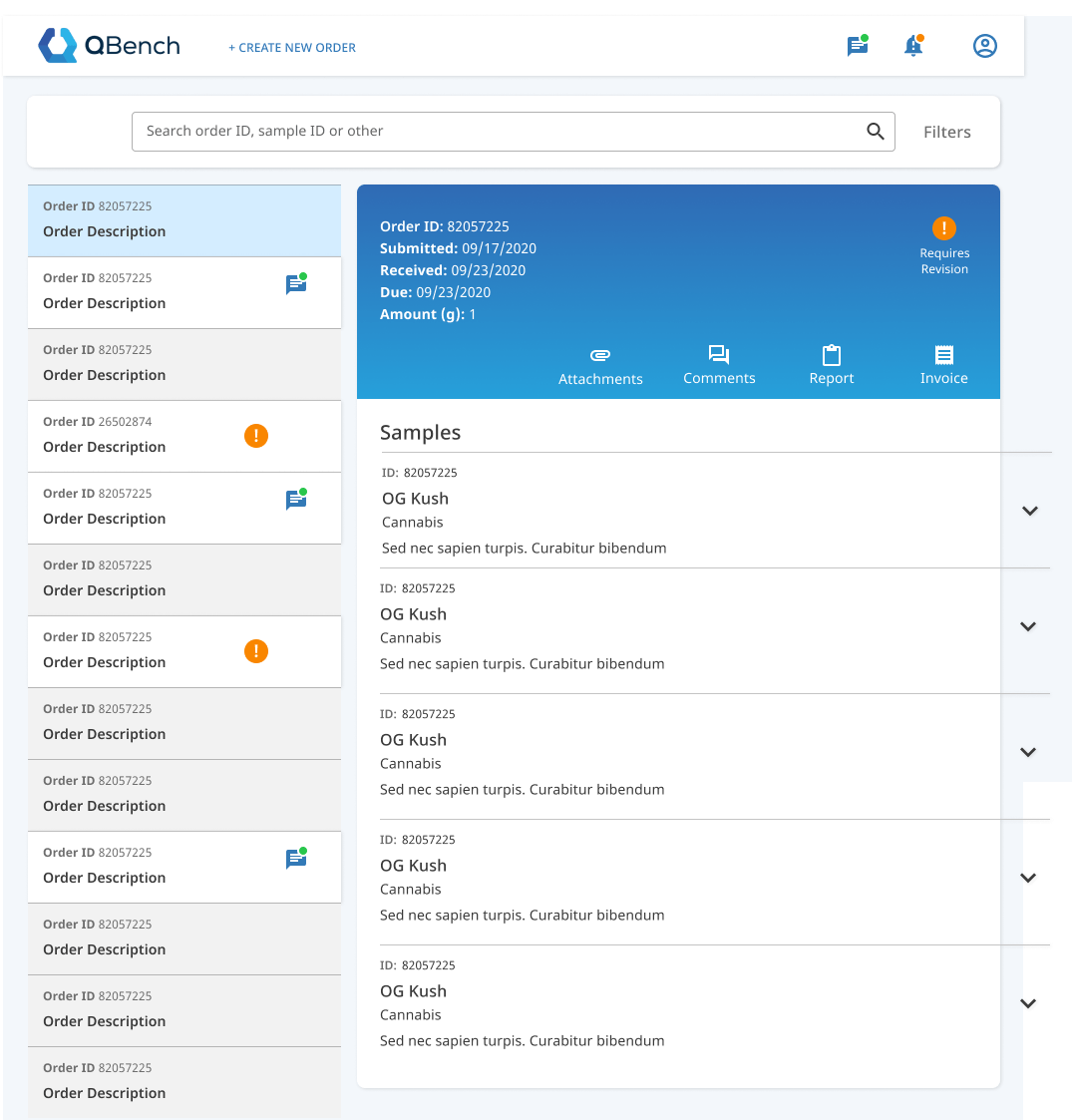
- Easily find previously submitted orders and see all up-to-date information and status on those orders
Discovery
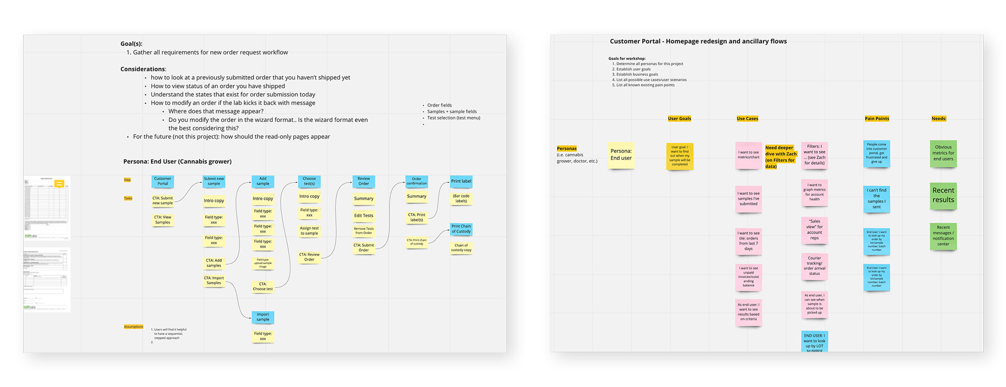
I conducted discovery workshops where all team members, including the development team, could offer input and insights in order to to clarify user goals, pain points and requirements. I used Miro to gather notes and insights. The main takeaways were:
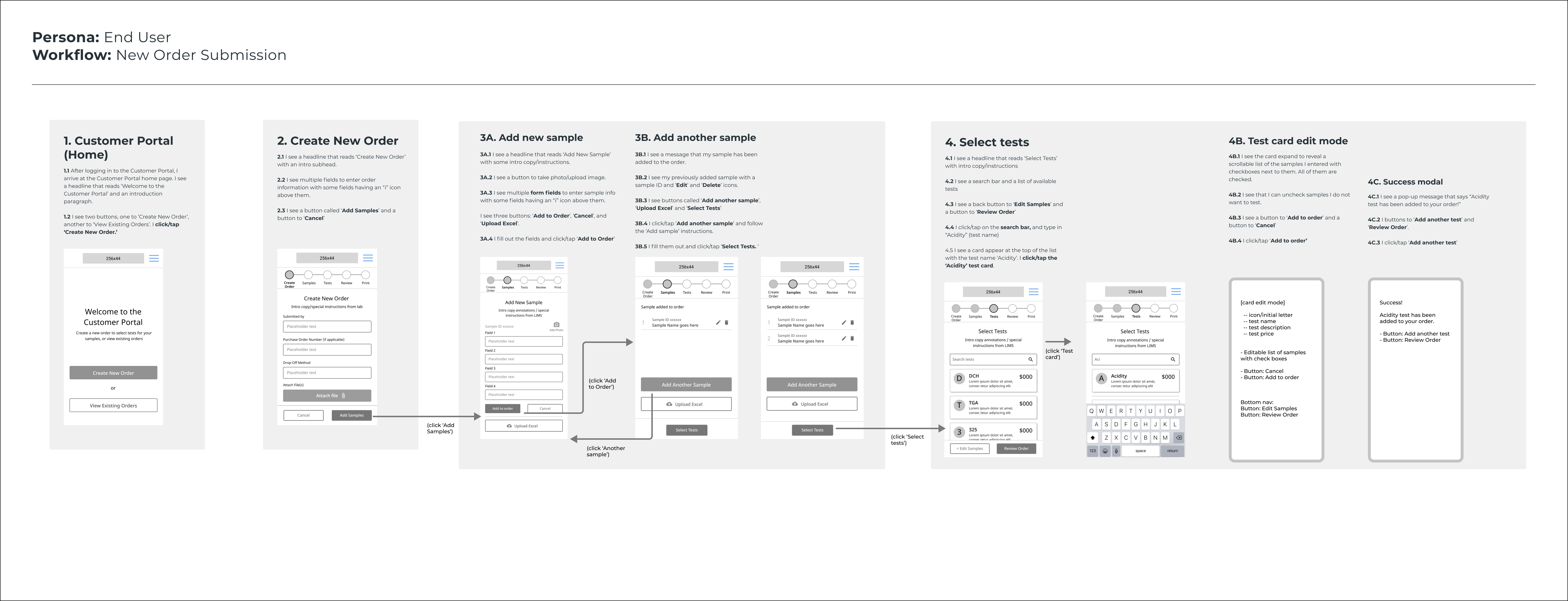
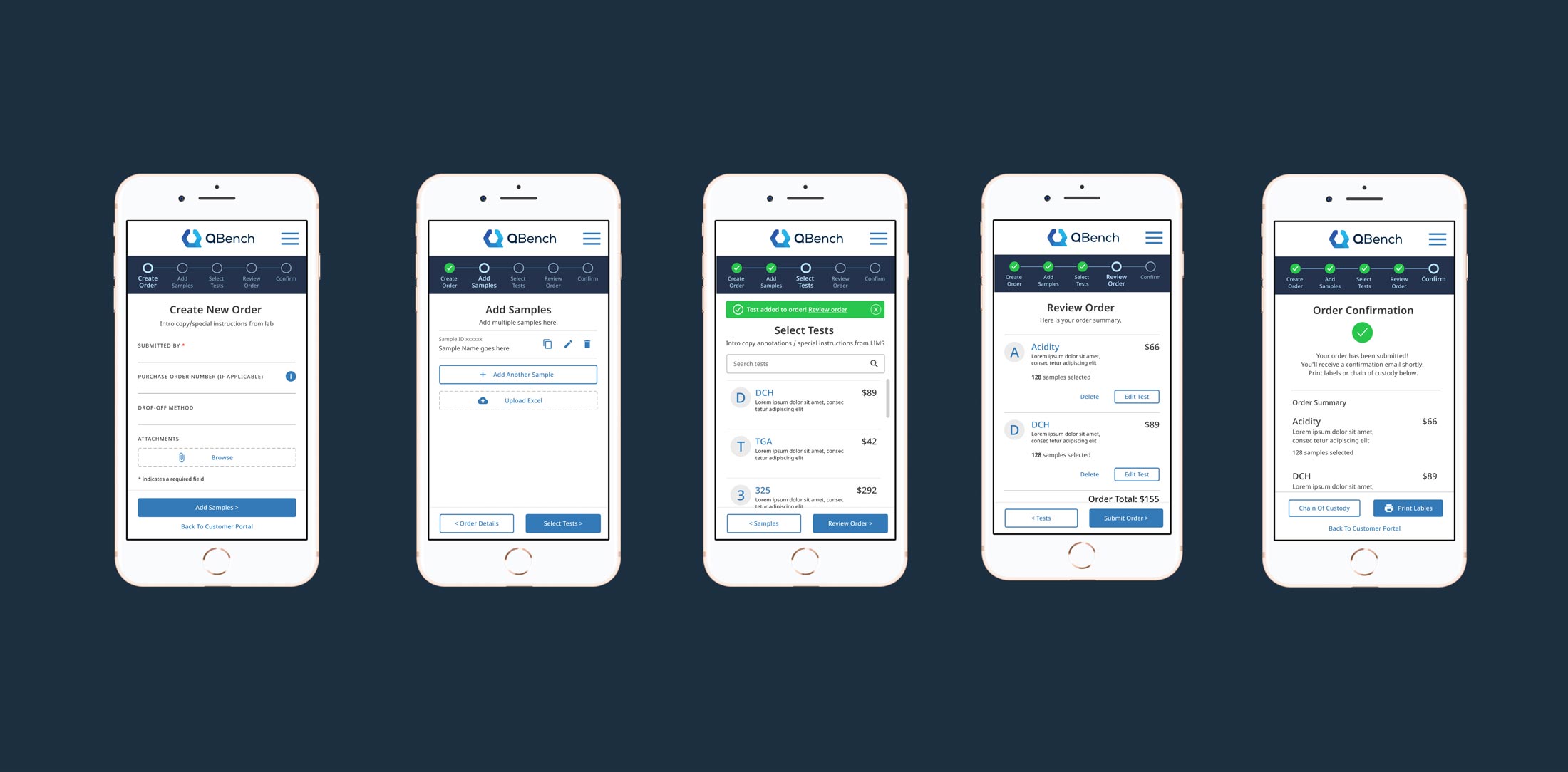
- A general plan and requirements for a step-wise wizard for creating and submitting an order
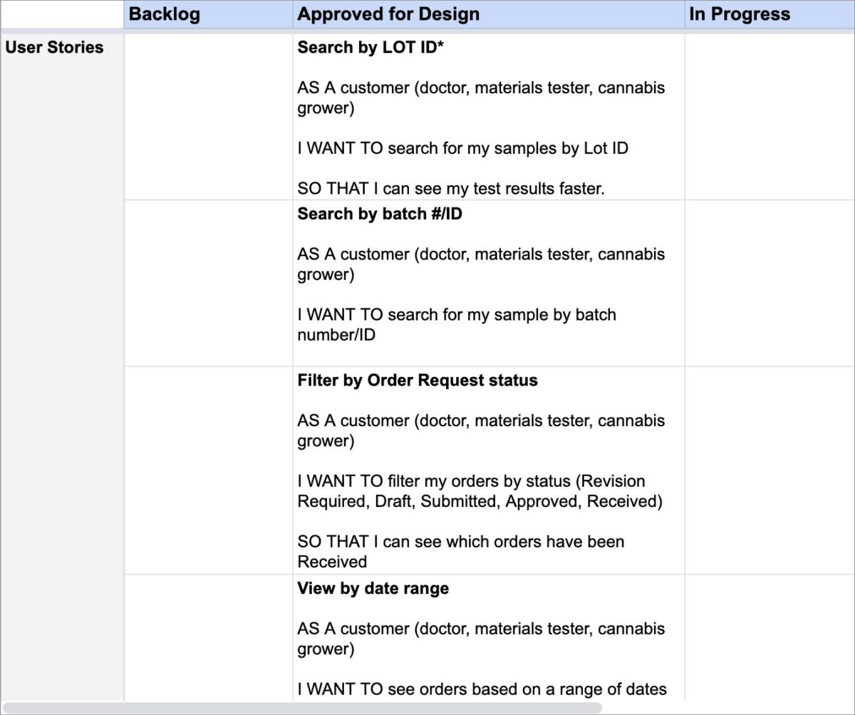
- For existing orders, a user needs to be able to:
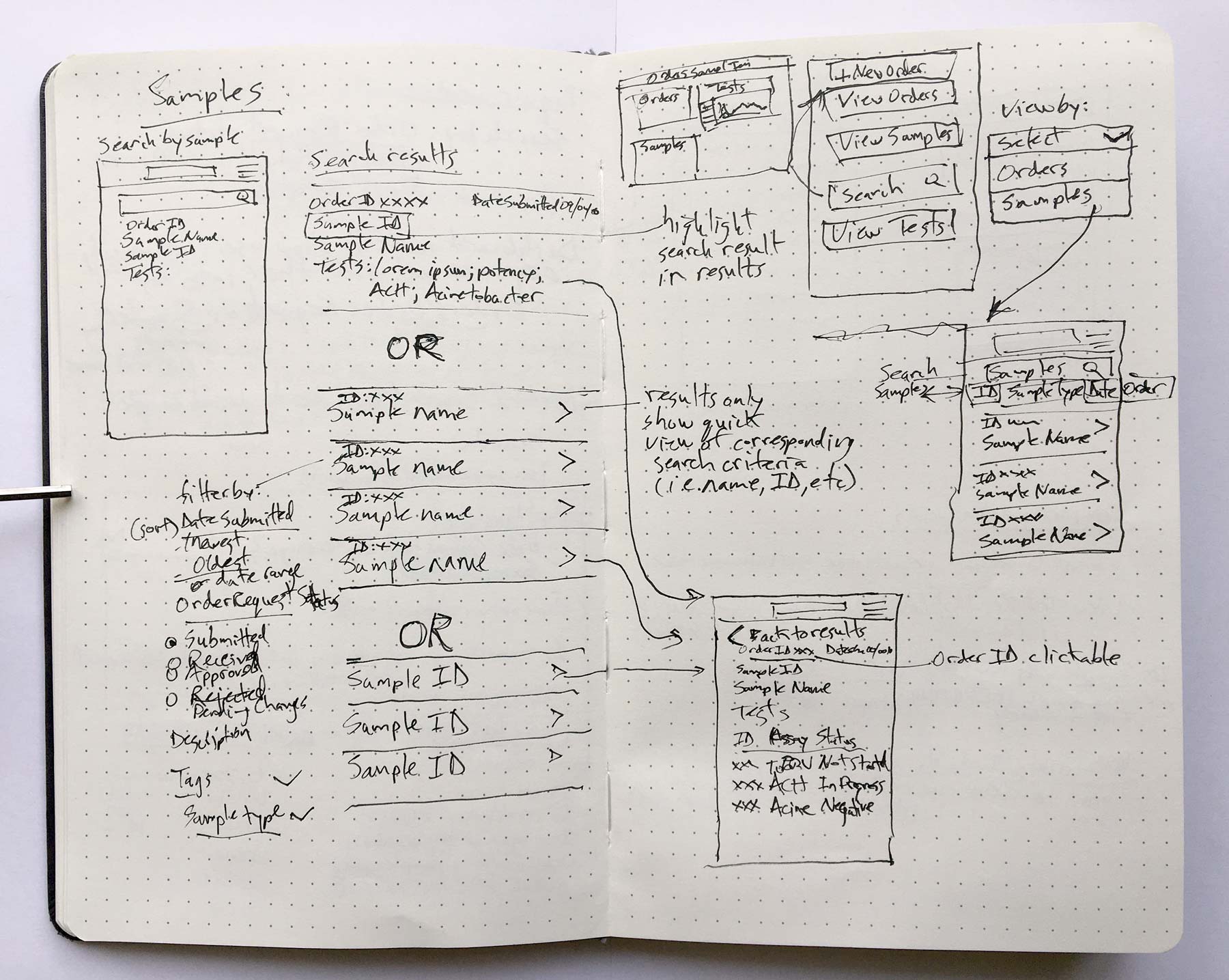
- Search by sample ID, lot ID or other data points associated with their samples
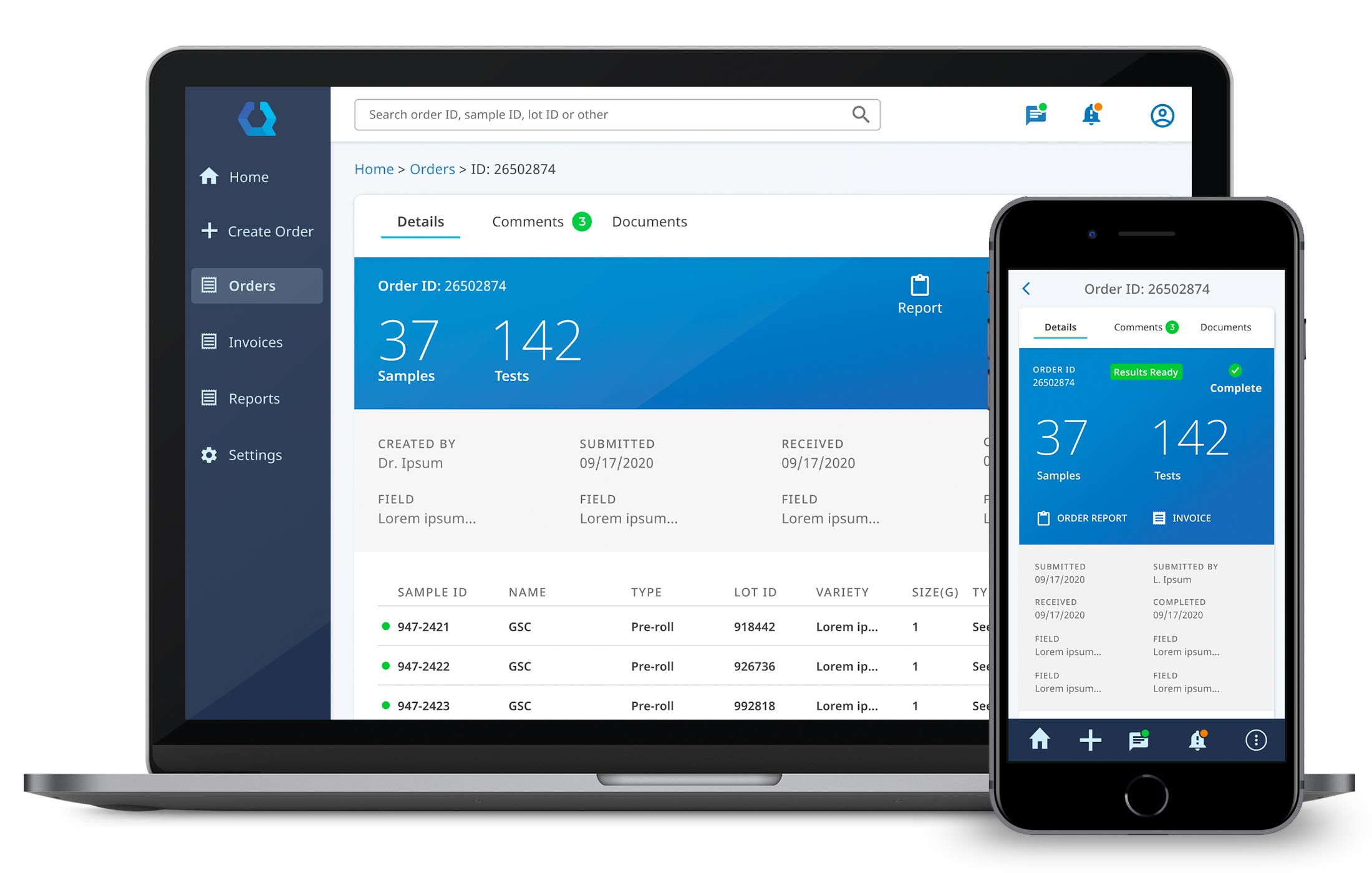
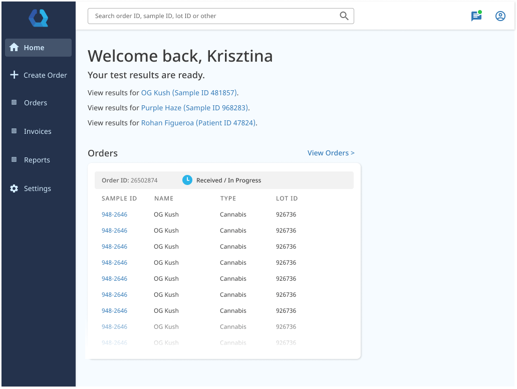
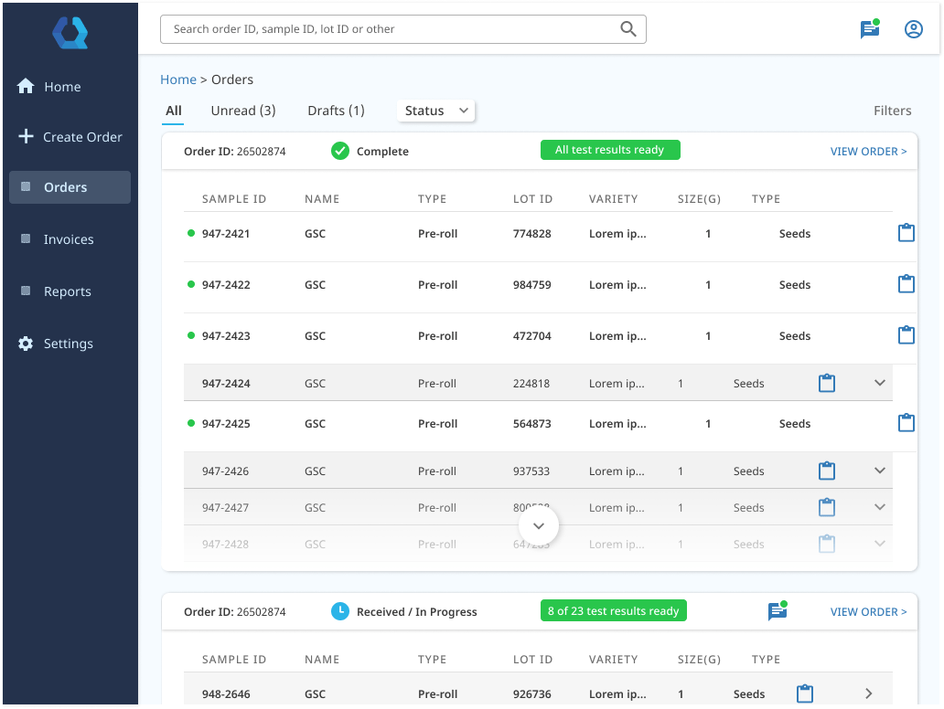
- Quickly see the status of an order and sample test results
Personas
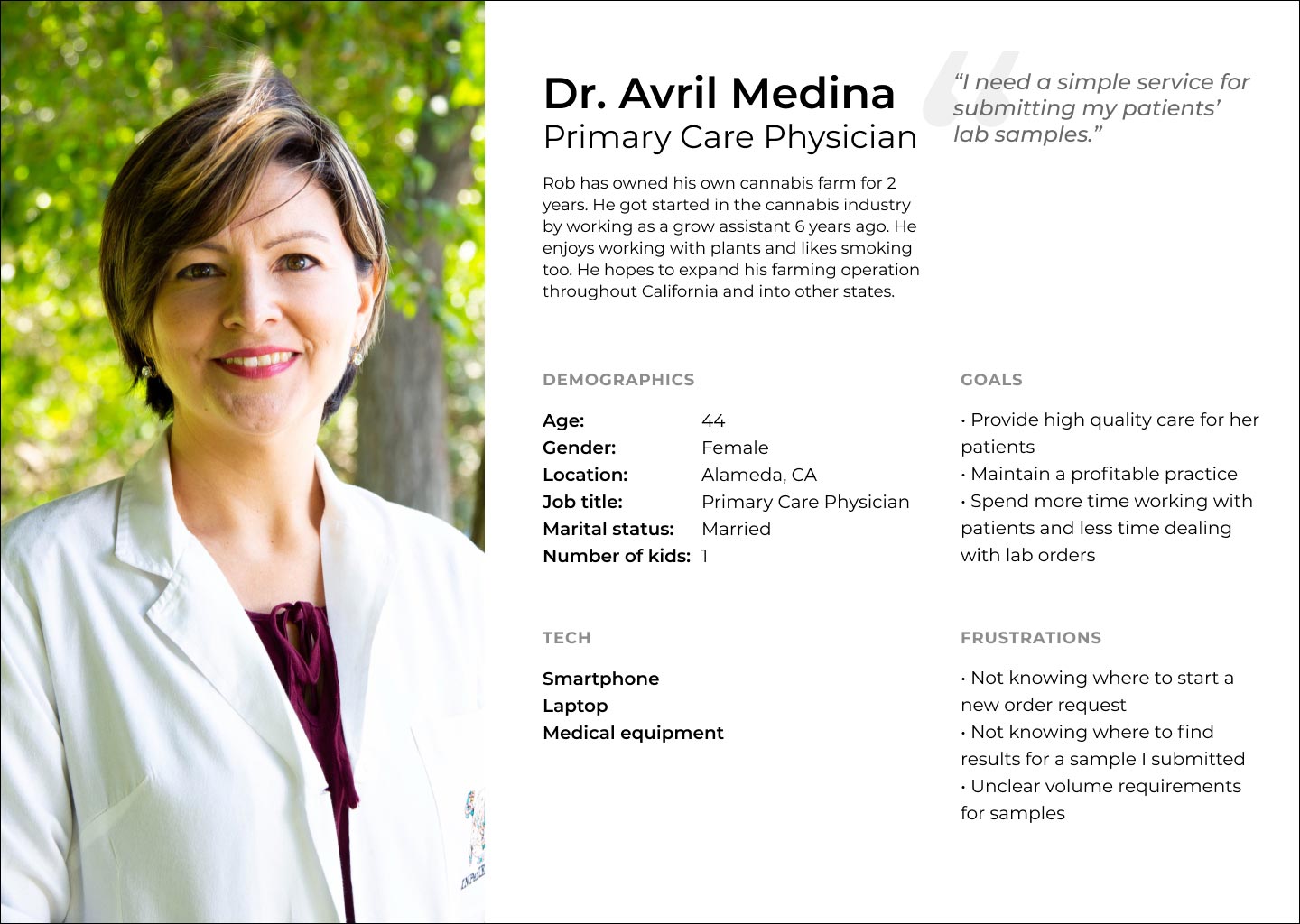
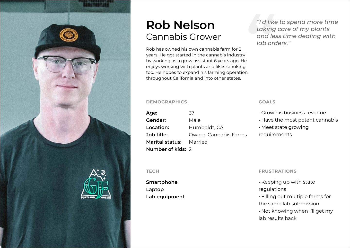
Based on learnings from stakeholder interviews, I put together personas for the most common end users, in particular, doctors, industrial materials testers, and cannabis cultivators.
Before and After
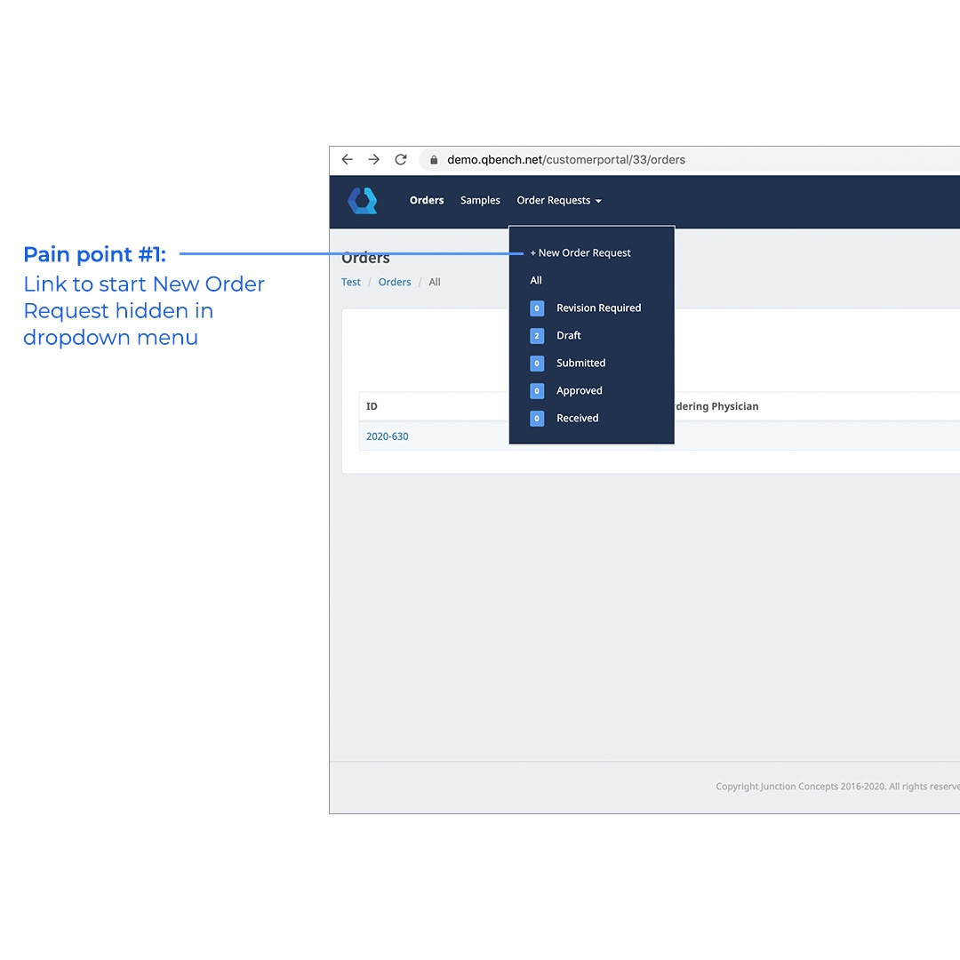
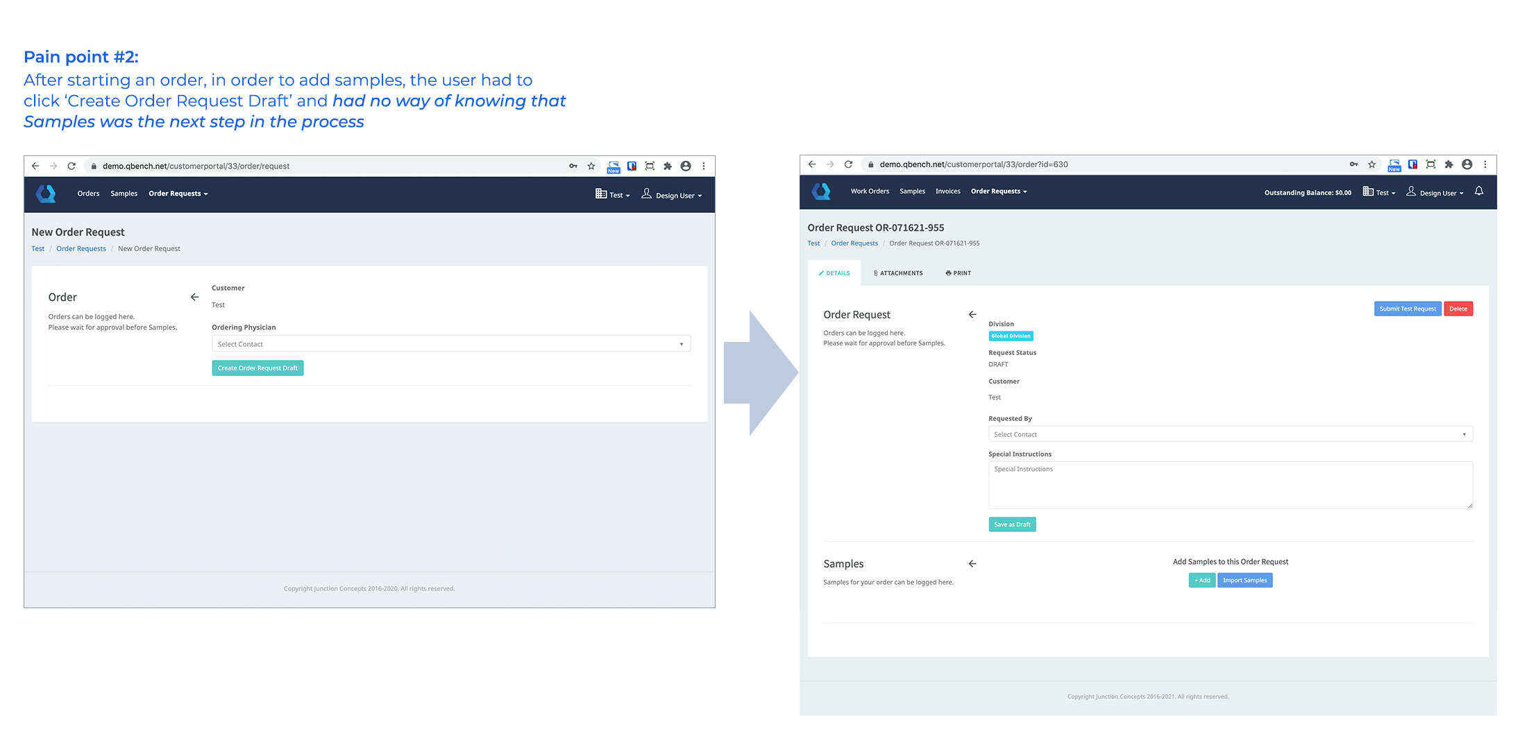
I started by looking at the current experience and analyzing what was not working and areas for possible improvement. Here are some of the “before” screens.
Usability issues:
- ‘New Order Request’ link was hidden in a dropdown menu, so users had no idea how to even start a new order
- When creating a new order, users did not know what was coming next as subsequent sections were completely hidden from view
- Users did not know how to print sample labels, which was mission critical for sending physical samples to the lab
Prototypes and Iterations
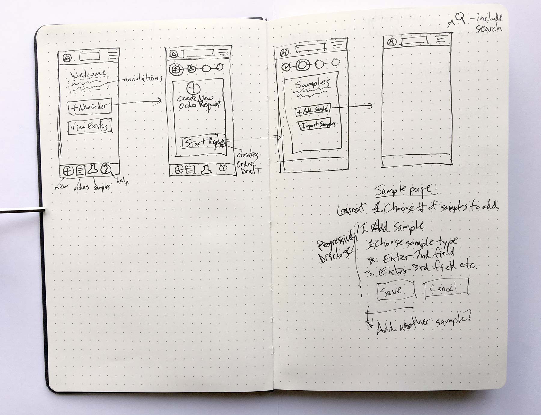
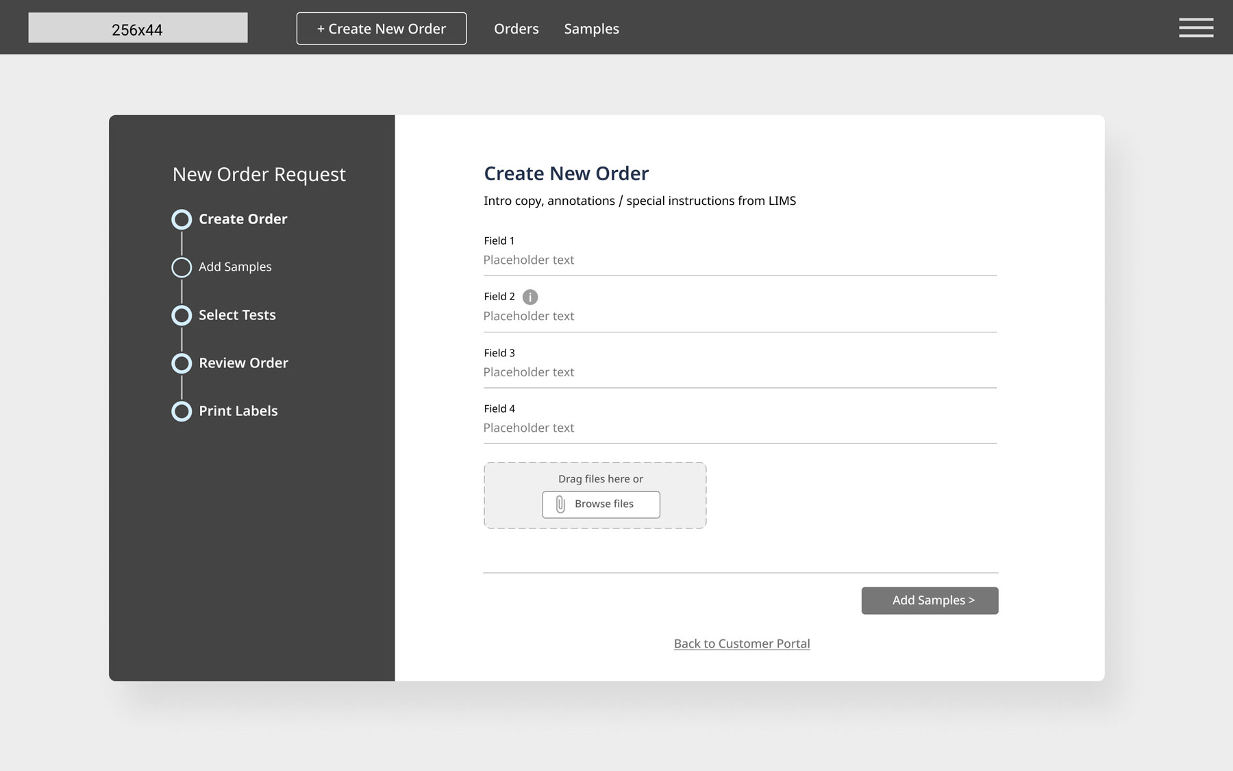
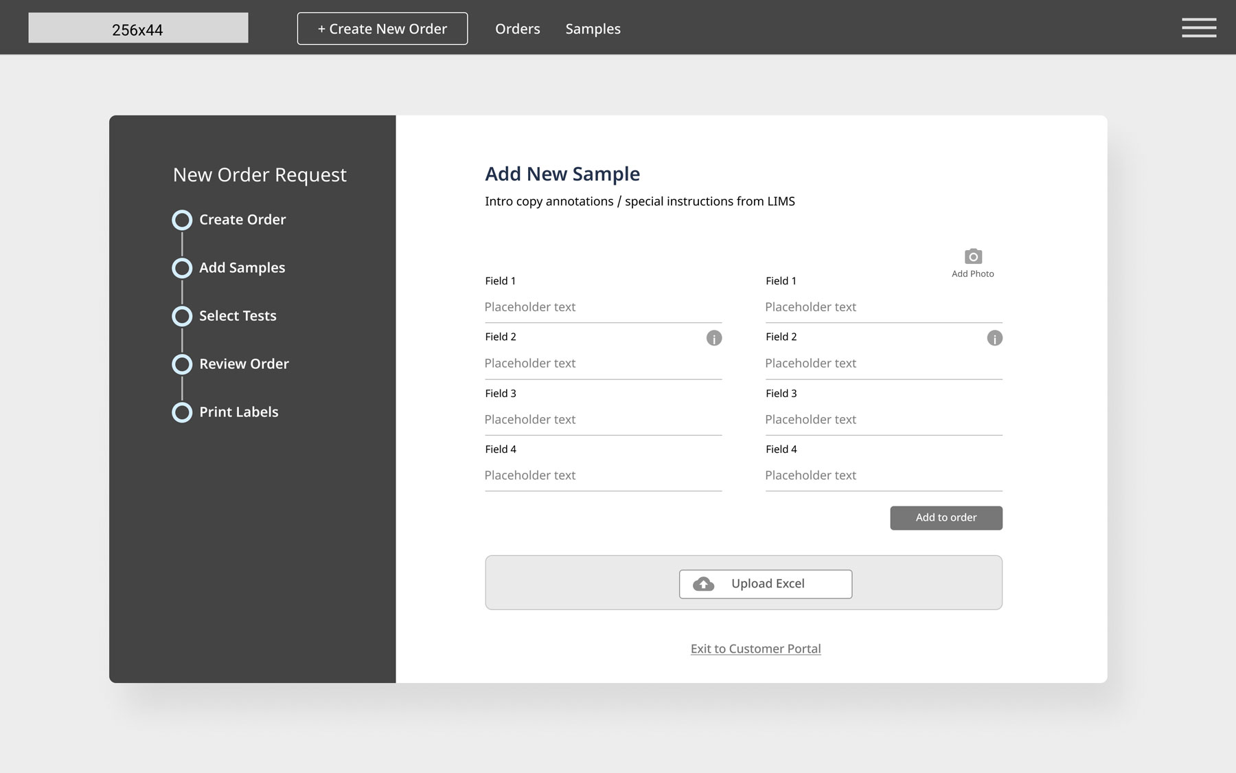
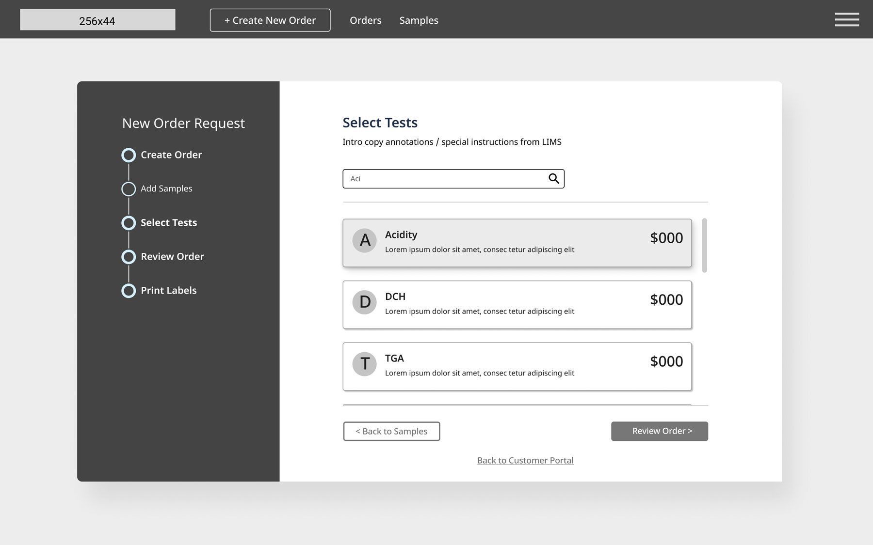
Starting with the ‘new order submission’ workflow, I took my initial sketches and created low-fidelity wireframes, which I reviewed with the stakeholders before creating an interactive prototype for mobile screens. This process went through a few iterations before it was approved.
I then scaled it up for tablet and larger screens and added color and a more polished visual design, which we then reviewed with the larger team.
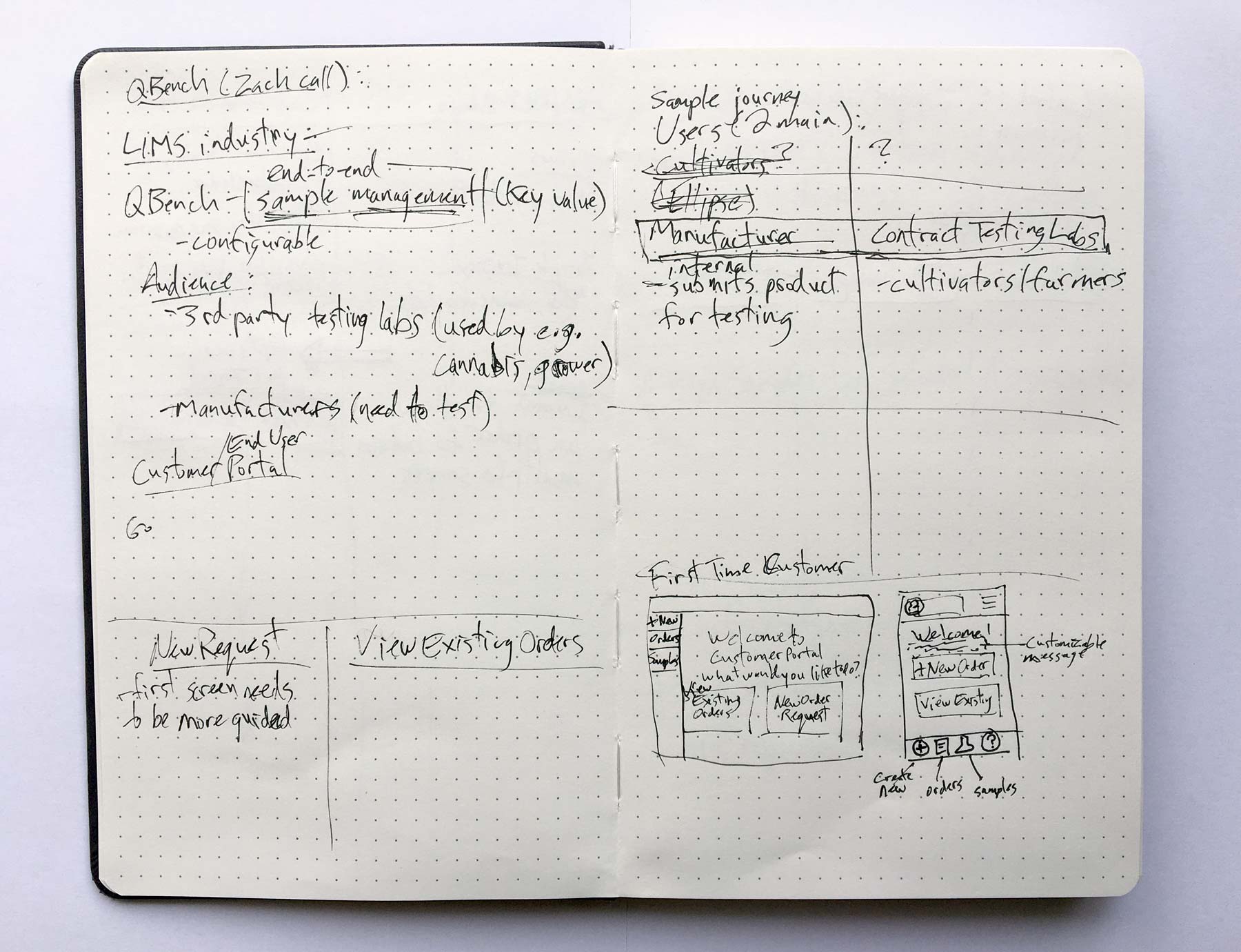
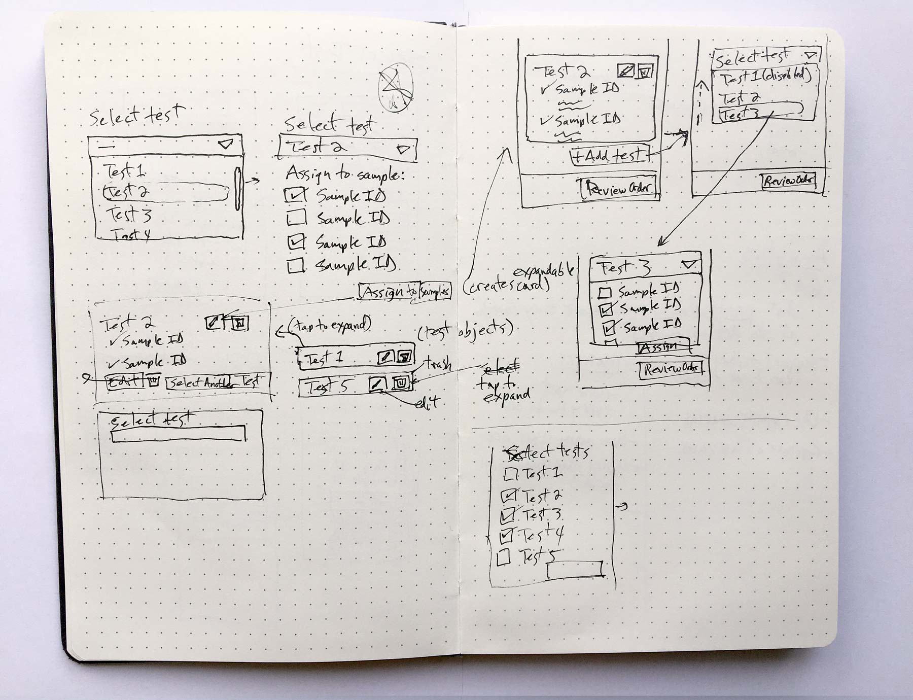
Initial sketches (new order request sample submission and test selection)
Sample low-fi wireframes (new order request wizard)
Early iterations of customer portal screens
New Order Request flow prototype
Customer Portal (existing orders flow) prototype
User Testing and Learnings
Once the prototypes for the ‘new order request’ as well as ‘current orders’ workflows were approved, I conducted usability tests with customers via Zoom of the working prototypes.
Customers were asked to perform a set of tasks while talking through their process in order to validate our assumptions and bring to light any unforeseen issues. The tasks were:
- Start a new order request, enter sample info, select tests and submit the order
- Find testing results for a sample by lot ID
- Print a sample report
I learned that users were having trouble finding the link to the orders page from the customer portal. I also learned that users were having trouble distinguishing between an Order Report and a Sample Report. I attributed this to the fact that the Order Report was simply called “Report”.
Project Status and Further Testing
The QBench customer portal is currently being coded and I’m in the process of QA’ing the designs with the development team. Once it’s launched, I’ll be conducting further usability tests with users and will monitor site performance with Google Analytics.


