UX DESIGN


Client: Circle Economy
Project: Circle City Scan Tool
Role: UX Design Lead
Agency: Iris Worldwide
Circle City Scan Tool is a web application developed for Circle Economy, an Amsterdam-based sustainability non-profit. The primary goal of the app is to enable municipalities, consultants or project developers to identify focus areas, discover opportunities and create action plans for their transition to the circular economy.
As UX Lead on an Agile development team, I was responsible for translating the business requirements and user goals into an intuitive and engaging user journey. I created the user flow map, all wireframes, interactions, visual/UI design, and a high-fidelity clickable prototype in Figma.
With an online knowledge base of over 3,000 case studies, Circle Economy wanted to provide urban planners and consultants with an easy-to-use tool to help them discovery circular economy opportunities that were best aligned with their strategy.
The Circle Economy team had already conducted initial user interviews and a workshop, which clarified user needs and goals. Based on this research, they wanted to create a recommendation engine, which would use user-selected focus areas, such as material flows, sector and impact areas, to present a scored view of the recommended opportunities.
Our job was to create an intuitive user journey for viewing the recommended opportunities, as well as selecting the focus areas. I worked with our product manager to write detailed user stories using the Gherkin (given/when/then) format. Then, using an Agile/lean UX approach, we worked in two-week sprints to build the MVP.
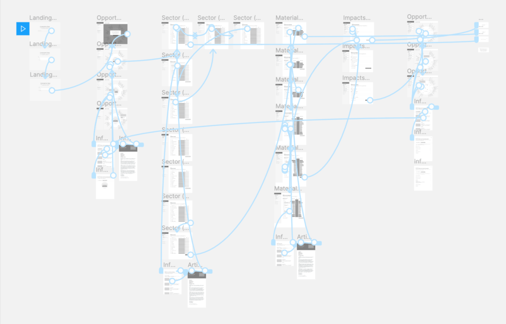
Taking the user stories, I created a user flow map, which detailed every proposed screen and interaction in the app, from the landing page, through to the final summary report.
Next, I created wireframes and a functional prototype for all screens and interactions in Figma, including hover and error states.
The primary user journey was to create a “scan” of a city, by successively selecting three focus areas: Sector, Materials and Impacts. The tool would then score and display the most relevant opportunities based on the focus areas.
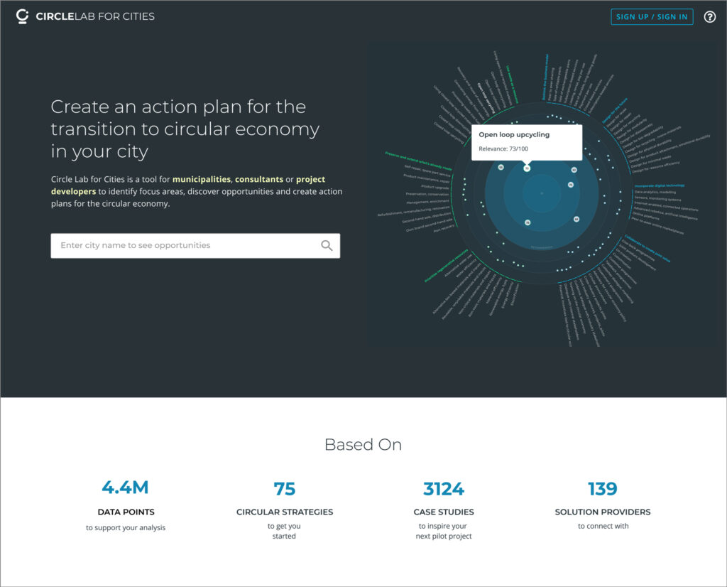
In order to quickly capture users’ interest, we opted to show a preview of the ‘Opportunities’ screen, a dynamic, interactive data visualization of all available Opportunities, which would be coded using the D3 Javascript library.

After testing the wireframes internally for usability, I designed all high-fidelity screens, which also included a component library. Screens were optimized to be viewable on tablet as well as desktop (mobile design was not part of the scope for MVP).

After the user enters a city on the landing page, they are taken to an interactive D3 data visualization of all available circular opportunities. Each opportunity has a hover state pop-up which shows the name and relevance score. Clicking on an opportunity triggers a slide-out info panel with deeper information and links to case studies. In order to see the scored Opportunities screen, the user needs to set their focus areas by first choosing a sector.
We opted for a side navigation to guide users through the steps of narrowing their focus. This included status indicators for current page as well as a quick reference of captured selections for each focus area.
On this screen, the user chooses a sector as their first criteria. Sectors can be sorted by alphabetical order, gross value added, jobs, or emissions. We used bar graphs to visually indicate relationships between each category.
Here and throughout the app, we used text links to indicate when an item (such as sector) had deeper information available. Clicking or tapping these links triggered a slide-out window with more info and case studies.
For the Materials section, we used React.js to display the material graph elements. We also enabled sorting by Input or Waste, as indicated by the sorting toggle icon. The materials themselves were accessible by using progressive disclosure in an accordion-style expanded view of each material group. Clicking/tapping the checkbox for a material group selects all materials within that group. We leveraged the same pattern of text linking to deeper content in the slide-out window.
After finally selecting their Impact areas, the user is presented with the scored view of available opportunities. They’re then prompted to select an opportunity, which generates a summary report of all of their selections. The report is meant to be used by city planning departments or consultants to create an action plan for the recommended opportunities.
After the beta release, Circle Economy reported positive feedback from users, including comments about the application’s ease of use, and it being a valuable part of their research.
© 2026 Michael Dooling.
