UX / UI / VISUAL DESIGN


Client: Disney Visa
Project: DisneyRewards.com Redesign
Role: Art Director, UX/UI Lead
Agency: True North
DisneyRewards (a division of Chase Visa credit cards) briefed us to redesign their website to create an intuitive experience for both prospective customers as well as current cardmembers, serving information that was relevant to both audiences.
As art director, I was tasked with the design of every screen and interaction on the site. This included redesigning their “rewards calculator,” new card design viewer, and a new section of the site featuring cardmember stories.
With thousands of monthly visitors, DisneyRewards.com needed a way to serve relevant information to current cardmembers, while simultaneously catering to prospective customers.
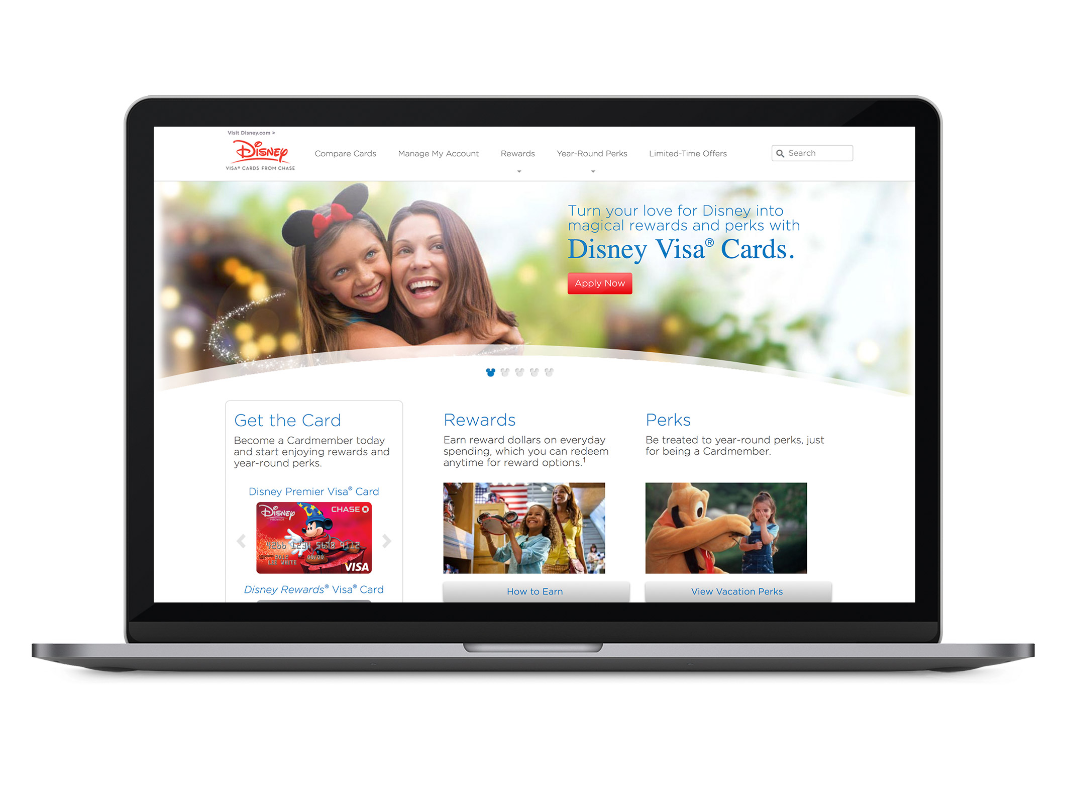
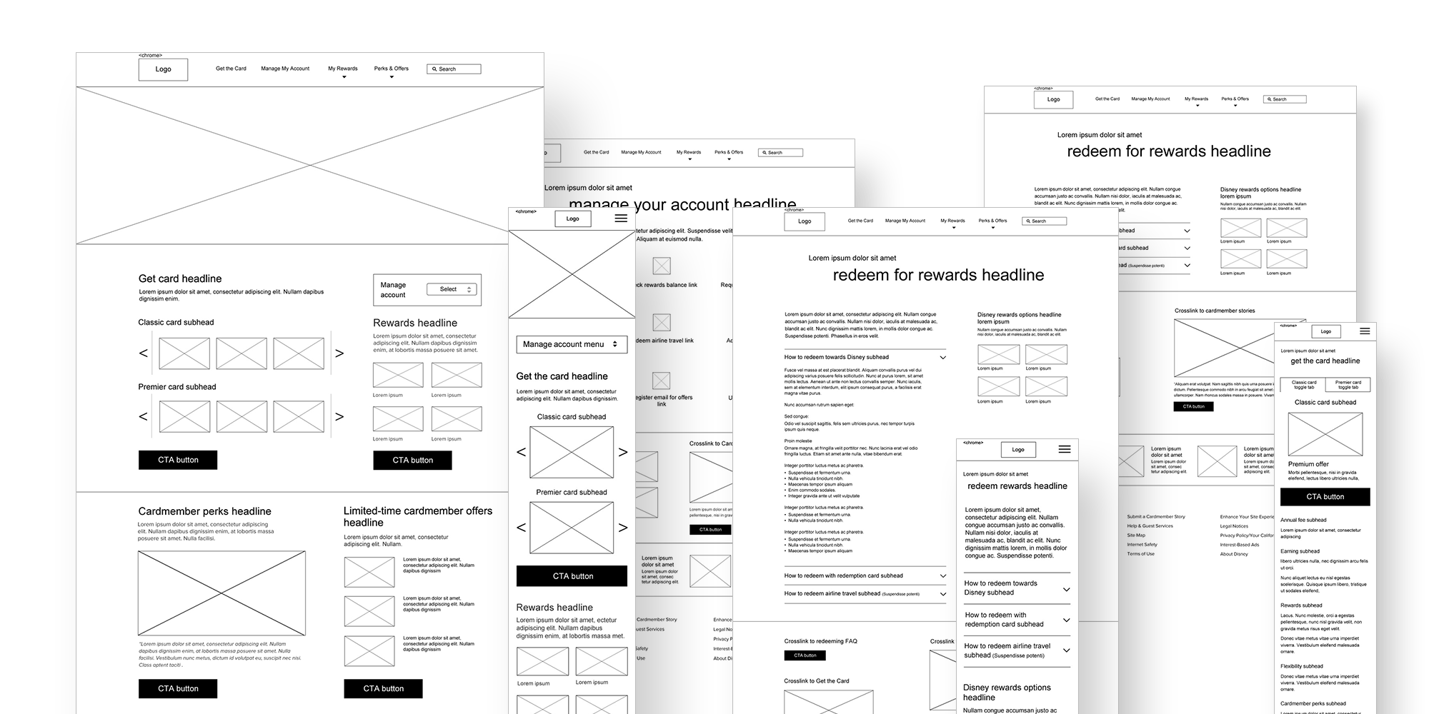
I started by sketching different layout options for the homepage and secondary pages, which were reviewed internally with the ACD and CD. When we agreed on the best approach, I proceeded to create digital wireframes for all pages, including desktop, tablet and mobile. I worked with our developer on a clickable prototype, which I QA’d to make sure all animated transitions and interactions were correct.
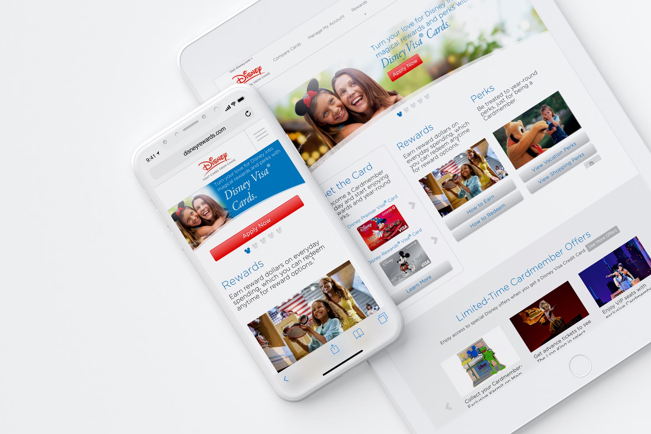
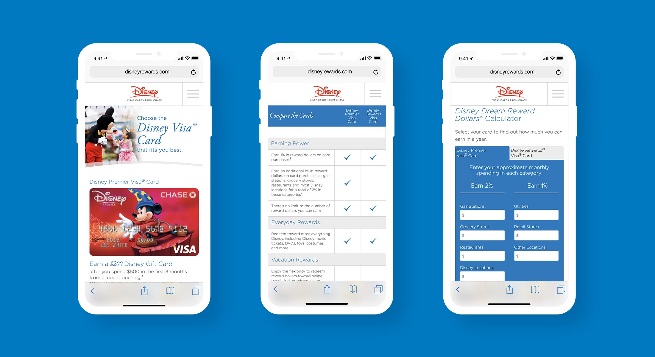
In order to maximize space on mobile, I used slide functionality for elements that were part of a series, such as card design options, offers and Disney news stories.
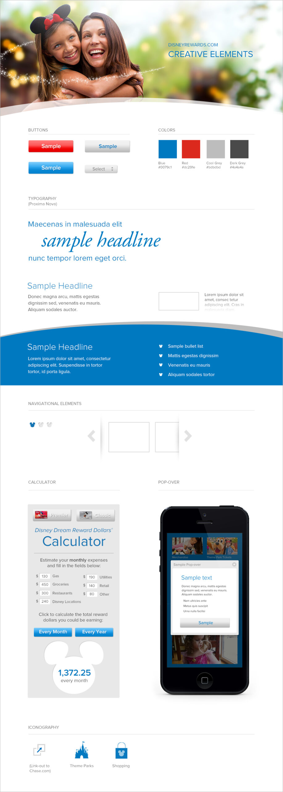
I created a site style guide, which included rules for typography, color palette, iconography, CTA buttons and other elements.
Months after the new site went live, the client reported that the average conversion rate for new customer sign-ups had met and exceeded their goals. Site analytics also showed that the average time on site had improved, particularly in key sections for current cardmembers.
© 2026 Michael Dooling.
